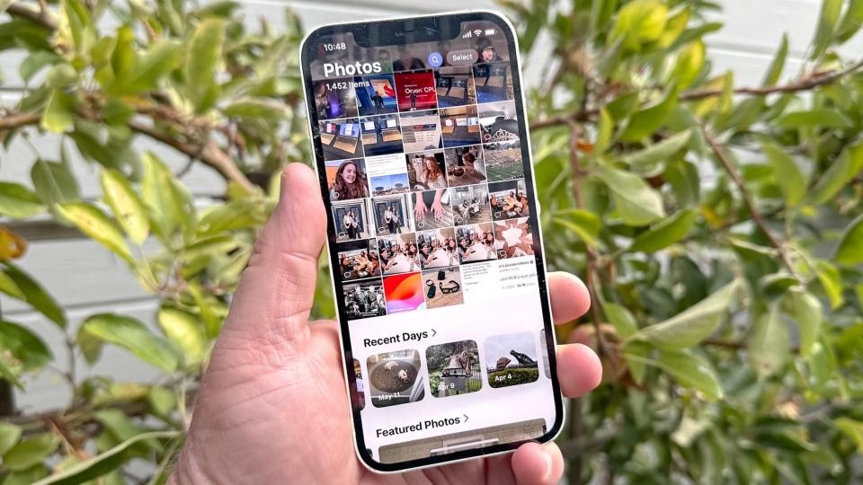
The dramatic redesign of Apple's Photos app in iOS 18 continues to spark heated debate among iPhone users, two months after its September release. The overhaul, representing the most substantial change to iPhone photo management in years, has left the user base distinctly split between those embracing the AI-powered future and others longing for simpler times.
At the heart of the redesign is Apple's push toward artificial intelligence, featuring a unified scrollable interface and smart collections that automatically organize photos into categories like "Recent Days" and "Trips." The app now boasts enhanced search capabilities, understanding natural language queries to help users locate specific images.
However, user feedback across social media and Apple community forums reveals persistent frustrations with the new design. Common complaints include difficulty navigating the redesigned interface, confusion from auto-generated albums, and the removal of familiar navigation tabs. Many users report struggling to find specific photos in what they describe as a cluttered layout.
"The new Photos app feels like it's trying to be too clever," says Mark Chen, a professional photographer and longtime iPhone user. "Sometimes I just want to quickly find a photo from last week, and now I have to wade through AI-generated collections I never asked for."
Apple has responded to user feedback with several updates through iOS 18 point releases. These adjustments include removing the controversial Carousel feature, bringing back the familiar pinch-to-zoom navigation, and announcing upcoming improvements to video playback.
Despite these refinements, the community remains divided. Tech-savvy users praise the AI-powered features and modern aesthetic, while others view the changes as an unnecessary response to competing platforms' AI photography features.
Sarah Rodriguez, a UX designer who has studied the redesign, notes: "Apple's challenge was balancing innovation with familiarity. While the AI features show promise, the execution has left many users feeling displaced in their own photo libraries."
As Apple continues to fine-tune the experience through updates, the Photos app redesign serves as a case study in the challenges of modernizing familiar interfaces while maintaining user comfort and efficiency.