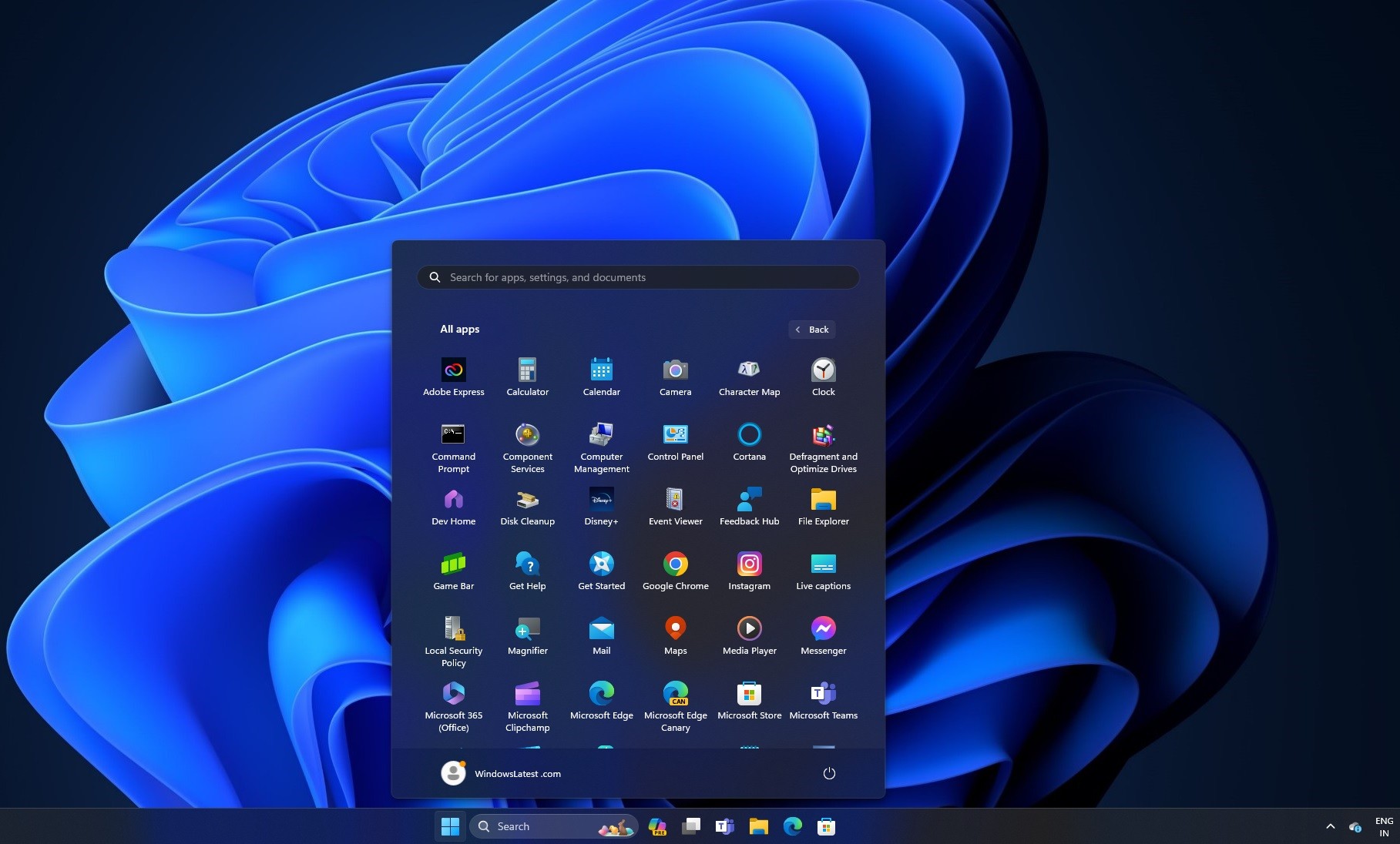
Microsoft is rolling out a fresh look for the Windows 11 Start Menu, aiming to streamline app organization and enhance user experience. The new layout, currently in testing phases, introduces automatic categorization of applications in the "All apps" section.
A New Way to Navigate Apps
Gone are the days of endless scrolling through an alphabetical list to find your desired application. The updated design groups apps into intuitive categories such as Entertainment and Music, reminiscent of mobile app libraries. This approach promises to make app discovery and access more efficient for users.
Key Features of the New Layout
- Automatic app categorization based on type
- Direct app launch from category icons
- Streamlined interface with hidden app names
- Diverse categories catering to different app types
The new layout bears a striking resemblance to the iOS App Library, suggesting a trend towards more intuitive app organization across platforms.
Testing and Availability
Currently, this feature is being tested in Windows Insider beta builds and is not enabled by default. Users can expect to see this update potentially included in the Windows 11 24H2 Update, slated for release in the fall.
In addition to the categorized layout, Microsoft is also experimenting with a Grid layout that groups apps alphabetically by their first letter.
Potential Concerns
While the new layout promises improved organization, some users have expressed concerns about the accuracy of app categorization and the lack of customization options. It remains to be seen whether Microsoft will address these issues before the final release.
As Windows 11 continues to evolve, this Start Menu update represents Microsoft's ongoing efforts to refine and improve the user interface, making app management more intuitive and efficient for its users.